Introduction
Lately I had to build a truly responsive website using Flutter Web.
As everybody agrees, Flutter does not yet ship with any built-in solution for responsive layout for Flutter Web. Browsing the list of existing packages, none I could test really gave me the features I needed.
Therefore, I decided to build my own "Bootstrap-grid"-like package. This article explains how I built it and how to use it.
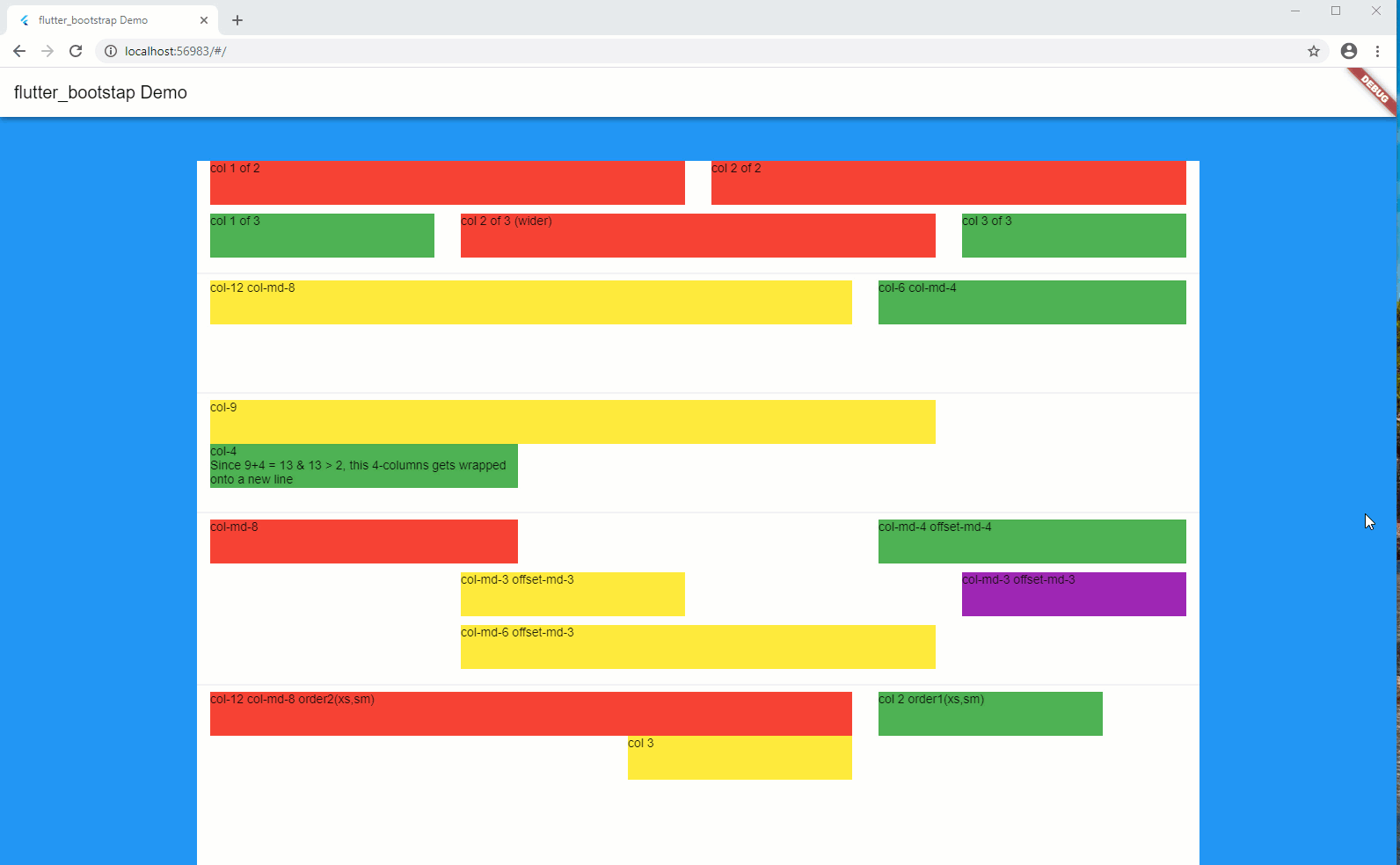
Full source code is available on [GitHub], together with a sample.
Package can be found on pub.dev under the name: flutter_bootstrap.
What is Bootstrap Grid?
Reminder
Bootstrap Grid is a very powerful mobile-first flexbox grid to build layouts of all shapes, using a 12-column system (see official documentation, here).
In short, your screen layout is ruled by a grid, which splits your width into a series of columns, usually 12.
Each of your components width corresponds to a certain number of columns on the screen, which therefore is translated to a certain percentage of the screen width. As an example, a component of a width of 4 columns (considering a max number of columns of 12), will occupy 33% ( = 4/12) of the available width.
A system of prefixes is used to define the dimensions of your component depending on the browser window total width. Here follows the usual list of prefixes:
- xs for extra small screens < 576px
- sm for small screens > 575px and < 768px
- md for medium screens > 767px and < 992px
- lg for large screens > 991px and < 1200px
- xl for extra large screens > 1199px
Nowadays the 'xs' prefix is no longer used and has been replaced by an empty prefix.
Notion of 'col-'
Thanks to these prefixes, you may specify the width of your component, based on the dimensions of your browser window.
For example:
'col-12 col-sm-12 col-md-6 col-lg-4 col-xl-3' will tell that your component will occupy:
- 12 columns for extra small screens
- 12 columns for small screens
- 6 columns for medium screens
- 4 columns for large screens
- 3 columns for extra large screens
Notions of Container and Row
Your layout is orchestrated around the additional 2 notions: Container and Row.
The Container corresponds to a block that contains a series of Rows, each of which containing a series of Columns.
The following pseudo code illustrates the notion:
BootstrapContainer(
  children: [
      BootstrapRow(
          children: [
              BootstrapCol(
                  sizes: 'col-12 col-sm-12 col-md-6 col-lg-4 col-xl-3',
                  child: Text('Column 1'),
              ),
              BootstrapCol(
                  sizes: 'col-12 col-sm-12 col-md-6 col-lg-4 col-xl-3',
                  child: Text('Column 2'),
              ),
          ],
      ),
      BootstrapRow(
          children: [
              BootstrapCol(
                  sizes: 'col-12 col-sm-12 col-md-6 col-lg-4 col-xl-3',
                  child: Text('Column 3'),
              ),
          ],
      ),
  ],
),
Notions of Fluid and Non-Fluid Containers
By default, a Container is limited in terms of width, depending on the browser window size.
The commonly used limits are the following:
- extra small screens: no limits
- small screens: 540px
- medium screens: 720px
- large screens: 960px
- extra large screens: 1140px
The container is then horizontally centered on the screen.
In some circumstances, you do not want such a width limit (e.g. you want to display a background color or an image, that takes the whole screen width). To allow this, a Container might be flagged as "fluid".
You may then combine both types of Containers to obtain a background color that takes the whole screen width, then another Container to display its content in a "centered" manner as follows:
BootstrapContainer(
  fluid: true,
  decoration: BoxDecoration(
      color: Colors.blue,
  ),
  children: [
      BootstrapContainer(
          children: [
              BootstrapRow(
                  children: [
                      BootstrapCol(
                          sizes: 'col-12 col-sm-12 col-md-6 col-lg-4 col-xl-3',
                          child: Text('Column 1'),
                      ),
                      BootstrapCol(
                          sizes: 'col-12 col-sm-12 col-md-6 col-lg-4 col-xl-3',
                          child: Text('Column 2'),
                      ),
                  ],
              ),
              BootstrapRow(
                  children: [
                      BootstrapCol(
                          sizes: 'col-12 col-sm-12 col-md-6 col-lg-4 col-xl-3',
                          child: Text('Column 3'),
                      ),
                  ],
              ),
          ],
      ),
  ],
),
Explanation:
- line 3: flags the Container as a Fluid one (= full-width)
- lines 4-5: you provide a background color
Notion of Gutter
A Gutter defines the horizontal padding that controls the space between each Column.
The usual gutter size is 30px, which says that each column leaves a horizontal space of 15px ( = gutter / 2) between each other.
Notion of offset-
At time, it is useful to give a certain offset (in terms of number of columns) which moves the column to the right of a certain number of columns.
Like for the dimensions, the offset also uses the same prefixes to give the rules depending on the screen dimensions.
For example:
'offset-0 offset-sm-1 offset-md-2 offset-lg-3 offset-xl-3' will tell that your component to be pushed to the right of:
- 0 column for extra small screens
- 1 column for small screens
- 2 columns for medium screens
- 3 columns for large screens
- 4 columns for extra large screens
Notion of order-
Sometime, you also would like to change the sequence order of your columns, depending on the screen dimensions.
In order to achieve this, you can use the order-, which together with the notion of prefix will tell in which sequence order, the components will be displayed on the screen.
For example:
'order-2 order-sm-2 offset-md-1 order-lg-1 order-xl-1' will tell that to display the corresponding Column as follows:
- 2nd position for extra small devices
- 2nd position for small screens
- 1st position for medium screens
- 1st position for large screens
- 1st position for extra large screens
Voilà, you now have all the basics to build your layout in a responsive manner.
Notion of conditional visibility
Finally, under some circumstances, it might also be useful to hide some parts of the layout, depending on the screen dimensions.
Implementation
This package exposes 4 new Widgets:
- BootstrapContainer
- BootstrapRow
- BootstrapCol
- BootstrapVisibility
...and a series of helper methods:
- bootstrapGridParameters
- bootstrapPrefixBasedOnWidth
- bootstrapMaxWidthNonFluid
- bootStrapValueBasedOnSize
BootstrapContainer
The signature of this stateless Widget is the following:
class BootstrapContainer extends StatelessWidget {
  BootstrapContainer({
    super.key,
    required this.children,
    this.fluid = false,
    this.decoration,
    this.padding,
  });
  ...
bool fluid (default = false)
determines whether the Container is fluid (= whole screen width)
BoxDecoration decoration
optional decoration to apply to the Container
EdgeInsets padding
optional Padding to apply to the content of the Container
List<Widget> children
array of Widgets, children of the Container
BootstrapRow
The signature of this stateless Widget is the following:
class BootstrapRow extends StatelessWidget {
  BootstrapRow({
    required this.children,
    this.decoration,
    this.height,
  });
  ...
}
double height
height of the Row
BoxDecoration decoration
optional decoration to apply to the Row
List<BootstrapCol> children
array of BootstrapCol, children of the Row.
A BootstapRow only accepts BootstrapCol as children.
BootstrapCol
The signature of this stateless Widget is the following:
class BootstrapCol extends StatelessWidget {
  BootstrapCol({
    required this.child,
    this.fit = FlexFit.loose,
    this.absoluteSizes = true,
    this.invisibleForSizes,
    String sizes = "",
    String offsets = "",
    String orders = "",
  });
  ...
FlexFit fit
How a flexible child is inscribed into the available space.
If [flex] is non-zero, the [fit] determines whether the child fills the space the parent makes available during layout. If the fit is [FlexFit.tight], the child is required to fill the available space. If the fit is [FlexFit.loose], the child can be at most as large as the available space (but is allowed to be smaller).
String sizes
corresponds to the different dimensions 'col-'
Example: sizes: 'col-12 col-sd-12 col-md-6 col-lg-4 col-xl-4'
String offsets
corresponds to the different offsets 'offset-'
Example: offsets: 'offset-0 offset-sm-1 offset-md-2 offset-lg-3 offset-xl-4'
String orders
corresponds to the different orders 'order-'
Example: orders: 'order-2 order-sm-2 order-md-1 order-lg-1 order-xl-1'
String invisibleForSizes
allows to define conditions where the child is not visible
Example: invisibleForSizes: 'xs xl'
bool absoluteSizes (default = true)
If [absoluteSizes] is set to [true] (= default), you force the dimensions of the Column to be relative to the screen dimensions and not to the parent Row.
If [absoluteSizes] is set to [true], the 'col-' are relative to the parent Row available width. This allows nesting the columns and adapt their dimensions in a "nested" way.
Widget child
the child, content of the BootstrapCol
BootstrapVisibility
This Widget allows to define whether to display (or not) the child, based on the definition of which 'col-' are present in the [sizes] parameter.
The signature of this stateless Widget is the following:
class BootstrapVisibility extends StatelessWidget {
  BootstrapVisibility({
    required this.child,
    String sizes = "",
  });
  ...
String sizes
corresponds to the different dimensions 'col-'
Widget child
the child to display (or not), based on the presence of the 'col-' that corresponds to the screen dimensions is present in the [sizes] property.
bootstrapGridParameters
This method allows you to customize the grid in terms of number of columns and gutter size.
Its signature is:
void bootstrapGridParameters({
  int numberOfColumns = 12,
  double gutterSize = 24.0,
}){
  ...
}
bootstrapPrefixBasedOnWidth
This method returns the prefix which corresponds to a certain width:
Its signature is:
String bootstrapPrefixBasedOnWidth(double width){
  ...
}
I personally use this method to know whether I am running on small devices and take appropriate actions.
Depending on the width, returns: '', 'sm', 'md', 'lg', 'xl'.
bootstrapMaxWidthNonFluid
Returns that max width in case of non-fluid display.
Its signature is:
double bootstrapMaxWidthNonFluid(double width){
  ...
}
bootStrapValueBasedOnSize
This routine allows to return a certain value based on the prefix definitions.
This routine requires the BuildContext to be provided.
Its signature is:
dynamic bootStrapValueBasedOnSize({
  required Map<String, dynamic> sizes,
  required BuildContext context,
}){
  ...
}
Example of use:
Typical case to use this method is to obtain a certain fontSize which might vary based on the screen dimensions.
final TextStyle buttonCaptionStyle = bootStrapValueBasedOnSize(
  sizes: {
  '':   Config.styleButtonLarge,
  'sm': Config.styleButtonLarge,
  'md': Config.styleButtonMedium,
  'lg': Config.styleButton,
  'xl': Config.styleButton,
  },
  context: context,
);

final double buttonHeight = bootStrapValueBasedOnSize(
  sizes: {
  '':   64,
  'sm': 64,
  'md': 64,
  'lg': 42,
  'xl': 42,
  },
  context: context,
);
Conclusions
This is not really an article but rather an explanation of a package, which is now available on pub.dev under the name: flutter_bootstrap.
As I needed to have something similar to Bootstap4 in order to build my last fully responsive Flutter Website, I developed my own solution and wanted to share it with you.
I hope this will be useful to some of you.